Branding guidelines
Thank you for your interest in GoodSync. Before using our trademark, we ask that you please familiarize yourself with our brand guidelines.
- We politely ask that you do not:
- Change, alter, or modify any part of the GoodSync logo
- Use it in a way that is misleading, obscene, or misrepresentative of the brand
- Use it in conjunction with images, drawings, illustrations, or other assets without permission
- Use the GoodSync name as part of your company or service, website name, product name, etc; Incorporate GoodSync logo into other logos
GoodSync Logos
GoodSync alternative logos
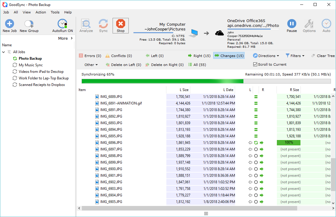
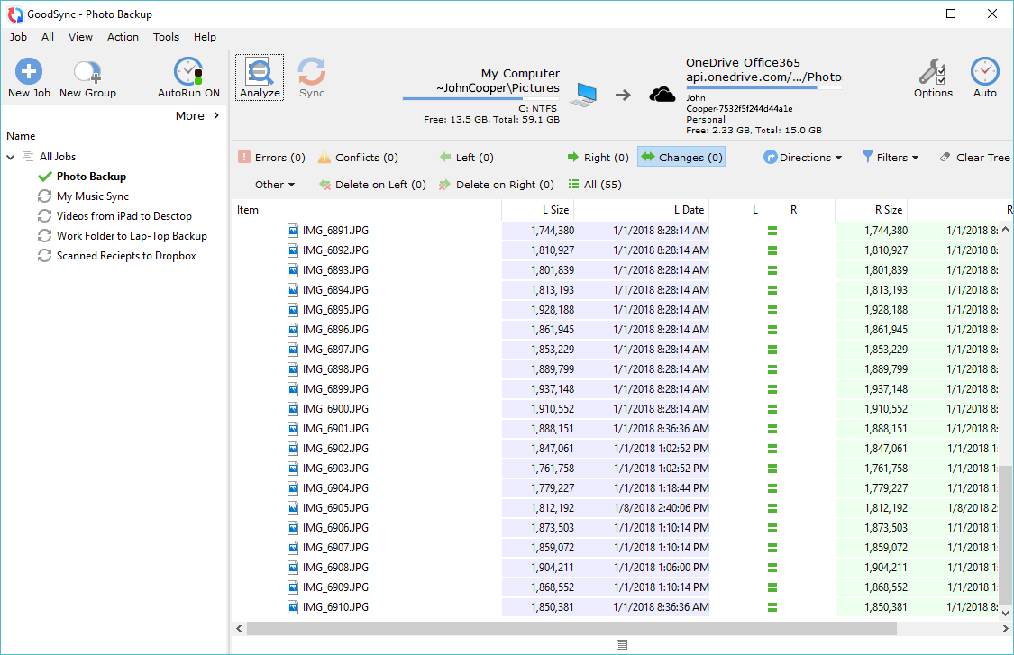
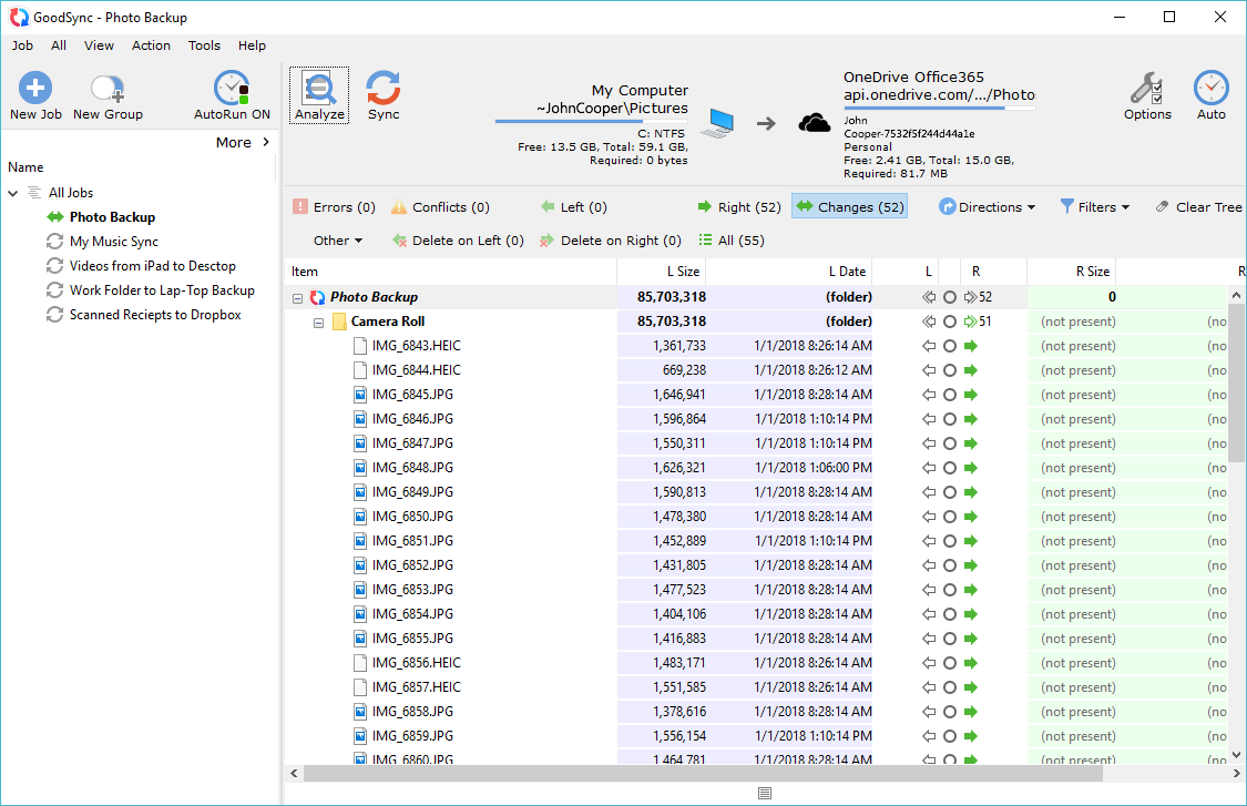
GoodSync screenshots
Guidelines
Clear space
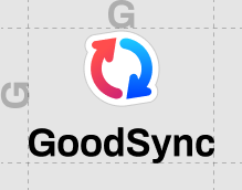
To preserve the logo's integrity, always maintain a minimum clear space around the logo. This clear space isolates the logo from competing graphic elements such as other logos, copy, photography or background patterns that may divert attention.
The minimum clear space around the GoodSync logo is designed by the height of the "G" in the logo.
This minimun space should be maintained as the logo is proportionally resized.
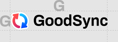
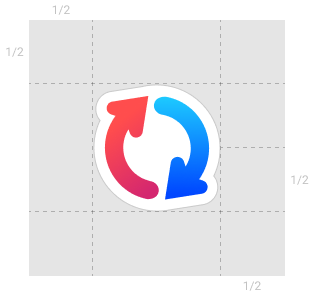
The minimum clear space around the GoodSync symbol is defined by the half of the height of the symbol itself. This minimum space should be maintained as the symbol is proportionally resized.
GoodSync colors


GoodSync typefaces
GoodSync preferred typeface is:
Myriad Pro Regular
Myriad Pro Bold
GoodSync web typeface is:
OpenSans Regular
OpenSans Bold
Logo misuse
Incorrect use of the GoodSync logo compromises its integrity and effectiveness. The examples of logo misuse below are not comprehensive; they are only are a small sample of possible misuses.